
A Celebrity Complaint That Resonates With Everyday Users
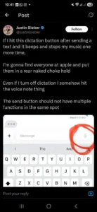
Bieber’s post was humorous, but it captured a relatable irritation. While texting, he said he often taps the dictation button by mistake, triggering a beep that pauses his music. Even after turning off dictation, he still accidentally activates the voice-note feature because it occupies the same corner of the keyboard.
His key argument was that a single UI corner shouldn’t control multiple functions that can be triggered unintentionally.
When Convenience Turns Into Confusion
Apple intended to consolidate communication shortcuts into a single, intuitive area. But for many users, especially those texting quickly, that design creates friction instead of flow.
Bieber’s tweet highlights three common pain points:
-
Accidental taps interrupt music or ongoing tasks.
-
Features activate even when turned off.
-
A send area that now doubles as a multifunction space, reducing accuracy.
A Reminder of Why UI Design Matters
Apple is known for simplicity, but this episode shows how easily a small placement choice can disrupt the everyday experience. In user-interface design, consistency and spacing are not aesthetic decisions; they determine usability.
Bieber’s humorous “UI rant” underscores a real design principle: user actions should be predictable, and high-frequency buttons must stay distinct from secondary features.
Will Apple Take the Hint?
Though Apple rarely responds to individual complaints, the company does pay attention to user sentiment. If enough users echo Bieber’s criticism, future iOS updates may reconsider the microphone shortcuts or reposition them to reduce misclicks.
Tech feedback can come from engineers, reviewers, or (as seen here) global pop stars who just want to send a text without accidentally recording a voice note.


